Executive Summary
A mobile application used by water-restoration technicians to track the drying of rooms and areas during flood repair. Moisture left behind can turn into mold, so tracking has to be correct and efficient. The prior mobile app mirrored the desktop app feature-for-feature, ran on a slow framework, and ignored basic mobile UX — so technicians preferred pen and paper. I led research and redesign around real field workflows and lifted adoption 9%.
Business Problem
- Most technicians combined the complex desktop app with pen & paper in the field
- The older mobile app carried every desktop feature, which made it bloated and hard to use for data collection
- Slow framework and poor mobile UX — tappable areas too small, fonts didn't scale, weak contrast
- Users literally couldn't target what they wanted to interact with or read what they needed
Team & My Leadership Role
Role: UX Research · UX Design · Developer
- Partnered with a Graphic Designer and Lead Developer
- Ran user interviews, sketches, wireframes, and design decisions
- Established a feedback loop with sales and customer support to feed customer comments into future updates
- Tools: Visual Studio, Notebook, iPad
Research
- Reviewed the existing application in detail
- Interviewed 7–10 users ranging from mid-20s to late 50s
- Talked with technicians in their 20s (mostly) and 40s about pain points, slowness, and missing functionality
- Observed that 30s–50s users preferred paper + desktop; 20s–30s users wanted the mobile app to actually work
- Iterated with the same interviewees again after design changes to sanity-check the direction
Key Insights
- Two root issues: finding what they needed to do their work, and interacting with the app itself
- Younger technicians wanted mobile-first; older technicians wanted the desktop paperwork surface preserved
- Keeping the app close to the original workflow was essential — familiarity was a feature, not a limitation
Strategic Decisions
- Preserve the familiar workflow so existing users didn't have to relearn the job
- Streamline layouts around field-critical tasks (drying, room/area tracking)
- Introduce new icons and a clearer color system to classify work at a glance
- Scale fonts, buttons, and icons for readability and gloved-hand tapping
- Trim desktop features that didn't belong on mobile — accept that some users would push back
Design Evolution
- 1Audit of the original app: framework, layout, tap targets, contrast, and scaling
- 2Interviews with 7–10 technicians across age ranges
- 3Sketches and lo-fi wireframes focused on streamlining the drying-tracking flow
- 4Reviewed sketches with the same users to validate the new concepts
- 5Neutral tradeoffs surfaced: palette refresh didn't help hierarchy; some removed desktop features were missed
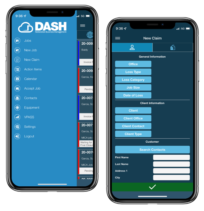
- 6Shipped a mobile-first workflow with iconography, scalable type, and clearer job classification
Outcome Metrics
+9%
Adoption lift
Most users had been on paper or not using mobile at all
No regressions
None of the updates were worse than before — a big win
Continuous customer feedback
Became a new in-house process for research and beta testing
Leadership Lessons Learned
"Continuous customer feedback wasn't a project artifact — it became an internal process that shaped every product decision that came after. That's the durable outcome."