NextGear Solutions - Dash Mobile
Role
Web Design | UX Design | Developer
Tools
Visual Studio, Notebook, iPad
Team
Graphic Designer, Lead Developer, Project Manager
Getting Started
Overview
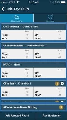
This project was migrating a mobile application from JavaScript to Xamarin forms (no small feat). The application is a tool that technicians use during flood repair to track the drying of rooms/areas.
It's a complex tool for a complex job. Any moisture left behind can turn into mold, so it's important to track its removal correctly and efficiently. There is a desktop application that is used for more of the
paperwork features (billing, employee tracking, etc..) that goes along with this mobile tool.
The Problem
The Challenge: How can we simplify the currently complex application to make it easier and increase adoption rate?
The original application had a lot going on in it (almost as much as the desktop application) and there lies the problem. Users weren't looking for a mobile solution to the desktop app.
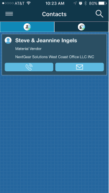
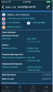
They just needed to get access to the spread sheets to enter their data. They needed to access customer information, billing and drying schedules. So I needed to remove a lot of bloatware in order to make the tool
useable and easier to navigate.
Interacting with the original mobile application was extremely difficult. The app was on a slow framework (so double/triple taps happened) and basic app usability was missed, like how large a tappable area should be,
scalable font sizes and basic contrasts. Users weren't able to properly target what they wanted to interact with. They also weren't able to read/see everything that they wanted to.
HUMAN CENTERED DESIGN
The Process
Research and Data
I reviewed the existing application and was able to speak to a handful of users (approx. 7-10). Our users range in age from mid 20's to late 50s. Most of the users that wanted to use the mobile app
were in the 20-30s range. The 30s-50s range were more content to use paper and input data on the desktop app after they got out of the field. The users I spoke to were mainly in their 20s, with 3 in their 40s.
We spoke about pain points, slowness, and missing functionality mainly.
The key issues noted were around 2 main struggles.
- Finding what they needed to do their work
- Interacting with the app itself
HCD
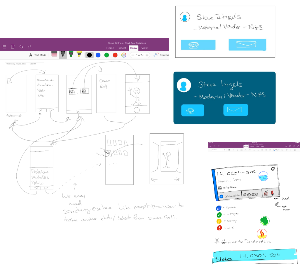
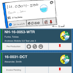
The Layouts
Sketching and Wireframing
I did a few wireframes and lo-fi mocks to show the new streamlined and easier to use concepts. Focusing on streamlining and overall UX, the app was kept close to the original to allow users to maintain that similar workflow.
I worked with the same customers we interviewed again to see if the changes made sense. Some updates were good, some were neutral, but none were worse. I also relied on our sales and customer support departments that
shared customer feedback (good and bad) to help direct changes.
Takeaways
The outcome was an application that was well received by our users. It was easier to use and more intuitive. This led to an adoption rate increase of 9%. (Most were still using pen and paper and transcribing
to the desktop app or not using that feature with us at all.)